I Redesigned Your Apps
I took two App designes and gave them a new look! Turned out super cool!
07-04-2021
I asked on Twitter and other social media channels about redesigning some of your apps!
We are going to go over 2 different apps, the first one is called Convene the other one is called Split It.
Convene
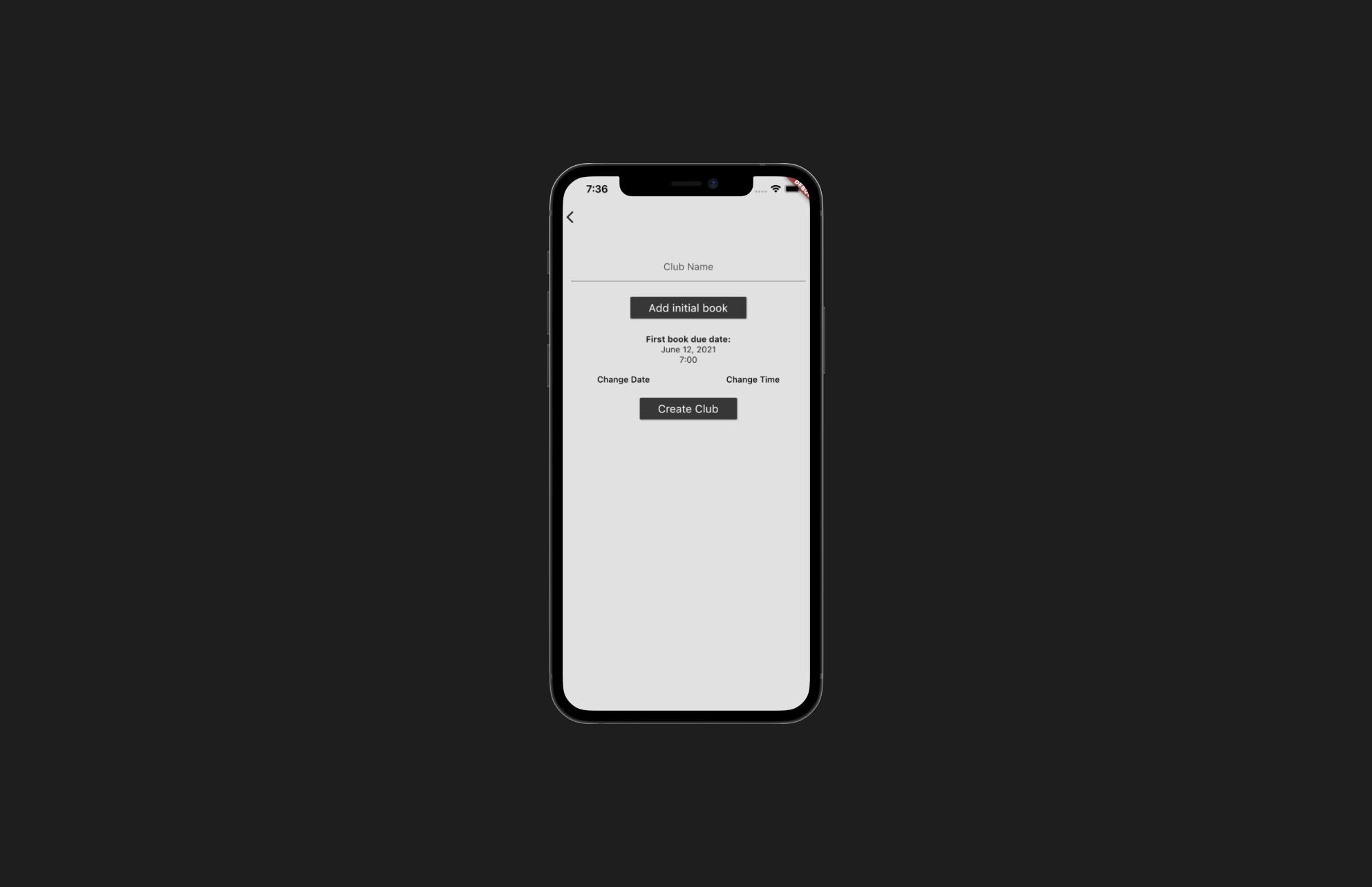
Let's start with this one and take a look at the current design!

To me this one was a bit all over the place and a lot of actions the user needed to do. The thing I wanted mainly to do here is split it up. What I mean with that is separating the different actions in to different screens!
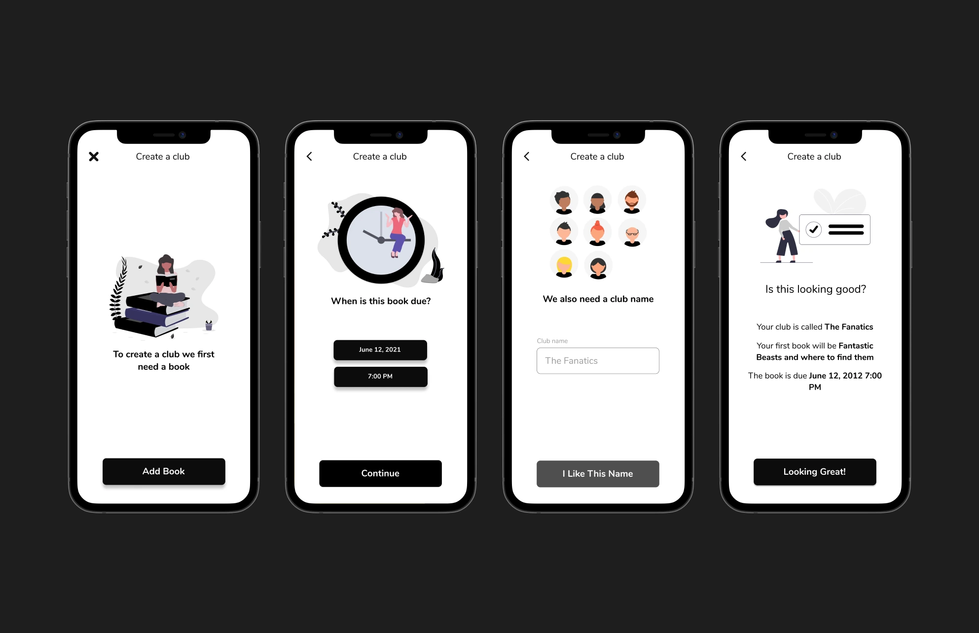
There were one thing I wanted to adhere to when updating the design. Which was keeping the Black & White colour scheme. Let's see what I did.

So what did I do? Well here is my thinking
- Making a CLEAR button that would be the primary action
- Finding some artwork
- Making it obvious which screen does what
- Show the result to the user so that they can decide with the full information
Just by breaking apart the design into different sections it was a lot easier to make it organized and look better. We could put everything on the same page but the idea here was that it's not a main action to create a club so this page wouldn't be shown that often. So making the process obvious for those times seemed like a good choice for me!
Split It
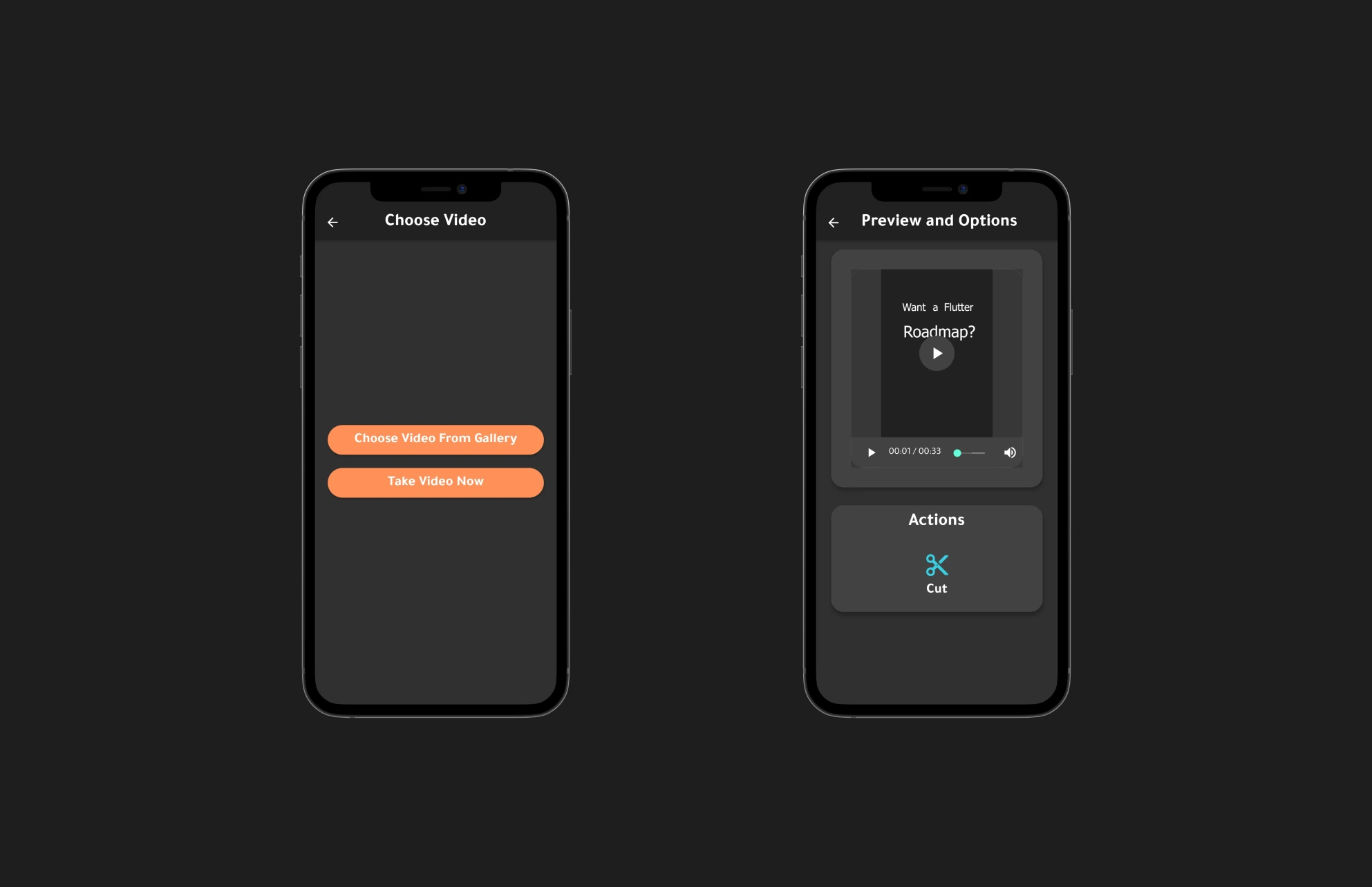
Let's take a loot at what we will be working with!

Now this design is very straight to the point and you understand what to do but it's missing some basic design concepts, such as contrast. Take the orange color and the white text and put it in a contrast checker and you will notice quite quickly that it's missing contrast.
Some other parts that were looking a bit off was how things like the buttons had a lot more rounded shape then other elements and a lot of overusage of "cards" in general.
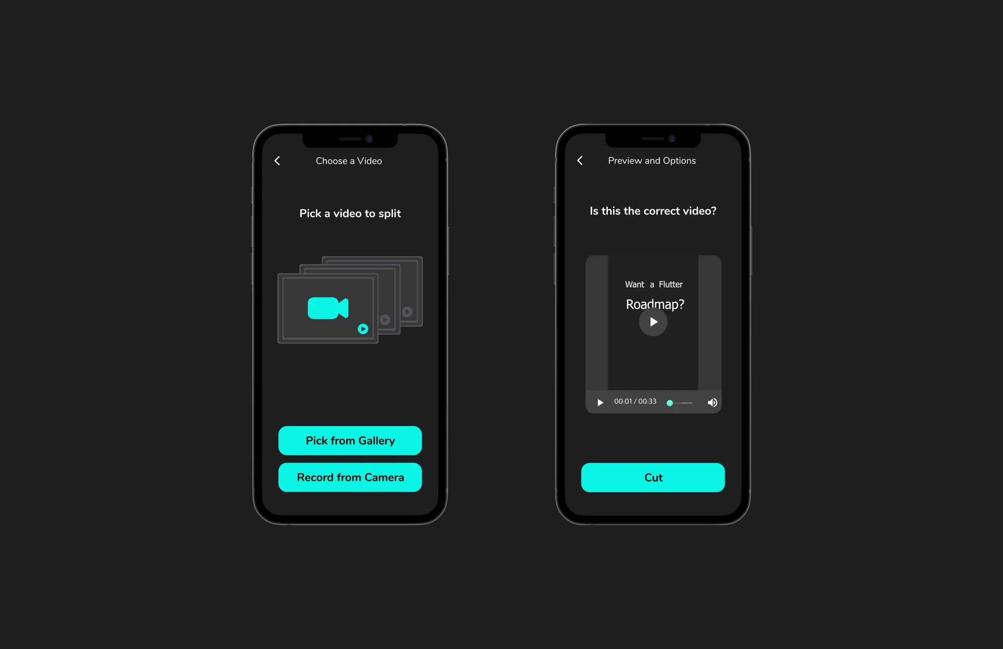
This is what I redesigned it to

I decided to do a couple of things.
- Change the primary color to a color that works better with a white text
- Remove some of the elevations/cards
- Keep shapes roughly the same radius
- Add some illustrations or fill the empty areas
With just these changes the design becomes a lot more user friendly, it's easier what to do and generally looks a lot better!
Summary
By using design basics we could improve the designs a lot by being more consistent, adhering to design basics such as contrast!